Experienced, smart and creative minds with entrepreneural sprit, a user-centric approach, a weak spot for storytelling and the power to execute unique ideas that help you elevate your brand and add value to many.
Selected Projects

Helene Fischer
Helene Fischer is arguably Germany’s only true pop star. She captivates people across all generations, genders, and social backgrounds. We were responsible for the campaign promoting her 20th-anniversary tour, covering out-of-home advertising, TV, and social media, as well as—a real highlight for us—several collector’s edition postage stamps created in partnership with Deutsche Post. More ›
Munich Fabric Start
Munich Fabric Start is one of the world's most important textile trade fairs, drawing the entire fashion industry to Munich twice a year. In 2026, we led the complete rebranding – strategically and operationally – and are responsible for all communications on and around the events, including print, on-site screens, online and social media. More ›
Ordio
Ordio is one of Germany's leading providers of workforce management software. Our goal was to shed the familiar underdog image in favour of a more mature presence that sends strong signals to both competitors and target audiences. To that end, we defined the entire brand foundation, core values and a new brand claim. All of which we incorporated in their communication. More ›
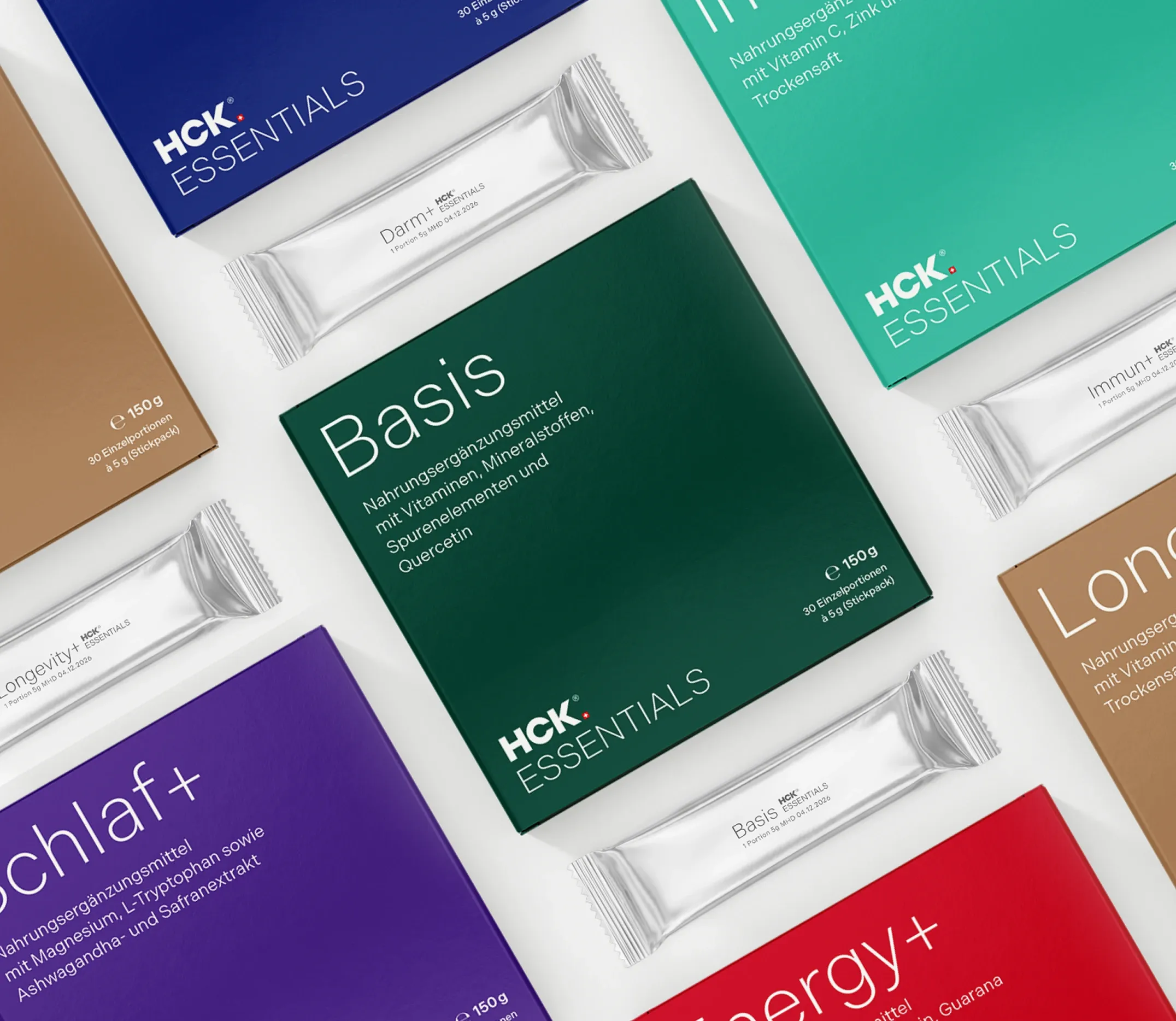
HCK®
HCK® is a traditional Swiss company that offers micronutrients tailored to individual needs, based on concrete laboratory analyses and a patented galenic formulation. We helped them relaunch their brand from the ground up to make it D2C-ready. This included the brand fundament, the corporate identity, the packaging design and the communication strategy. More ›
GLS Bank
We helped Germany's most sustainable bank – and its best bank for gender equality, transparency and climate protection – communicate its products and services, and the world, just a little. More ›
Clients
Awards