Munich Fabric Start
How we helped a trade fair find its voice again – increasing both efficiency and effectiveness of its communications.
Munich Fabric Start is one of the world's most important textile trade fairs, drawing the entire fashion industry to Munich twice a year. The event spans 8 areas, each with its own distinct thematic focus.
In 2026, we led the complete rebranding – strategically and operationally – and are responsible for all communications on and around the events, including print, on-site screens, online and social media. This also encompasses the development of the respective mottos and their accompanying key visuals.
Brand
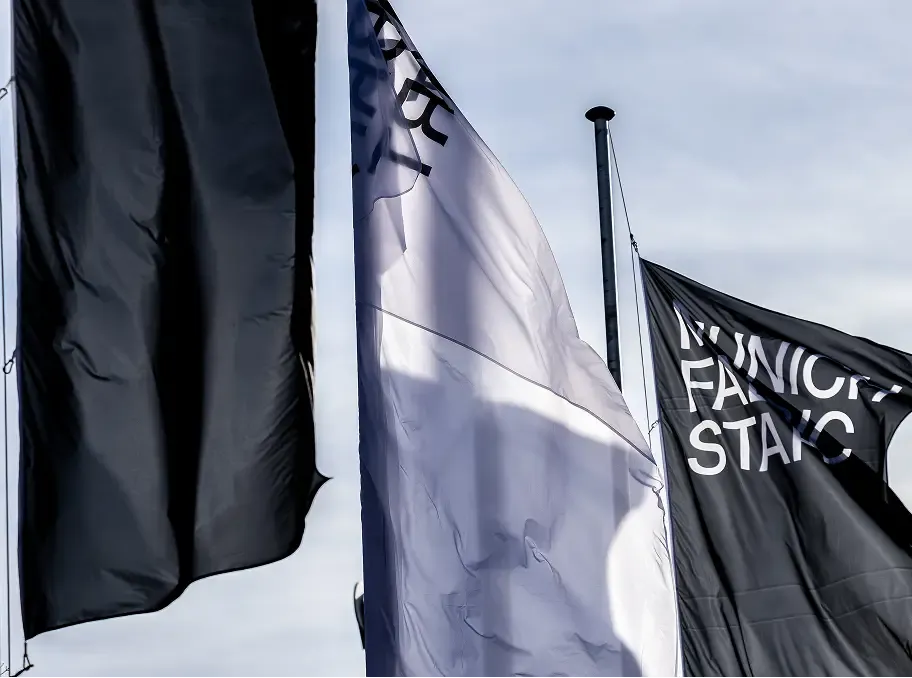
We began by sharpening the fair's sense of identity together, before rebuilding its entire brand from the ground up. It was important to us to establish a neutral foundation that nonetheless carries a high recognition value – creating a platform on which brands, collections, colours, images, fabrics and, not least, seasonal motifs can truly shine.
A fair of this scale demands a highly flexible corporate design. It starts with the logo, which needs to be optimised for every conceivable application. Self-explanatory at the first touchpoint, attention-grabbing and instantly recognisable when serving as orientation, playful in familiar contexts, compact as a footnote or in co-branding.
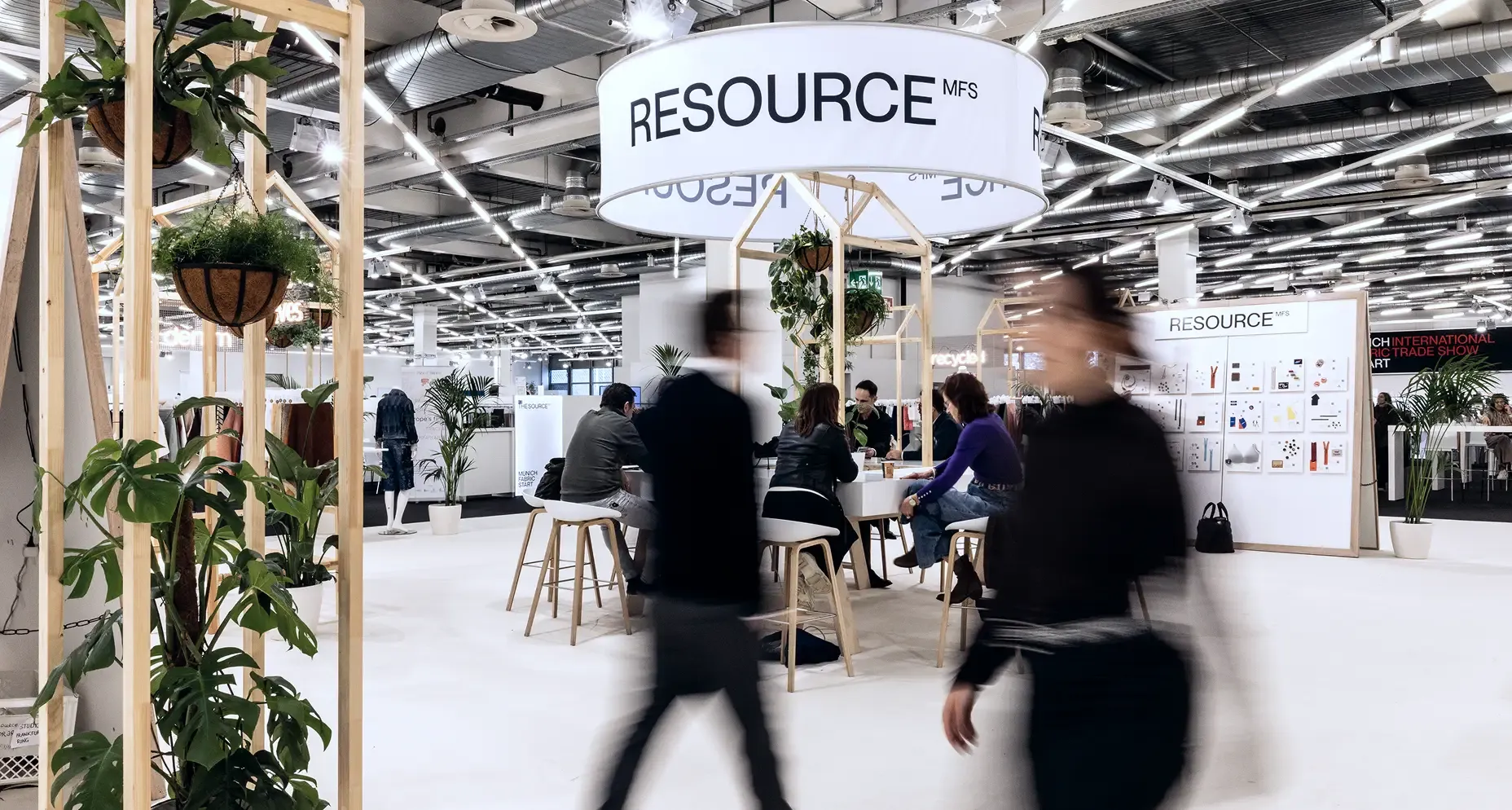
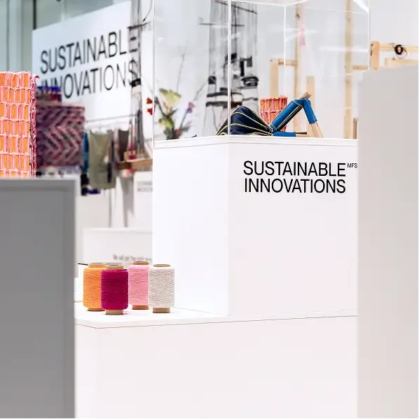
Information Architecture
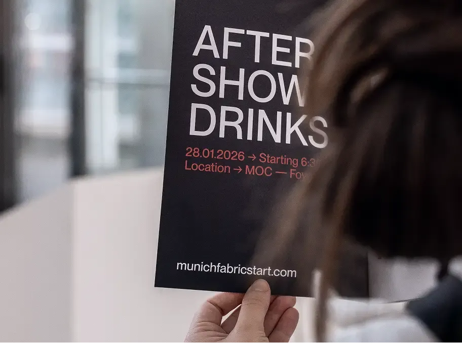
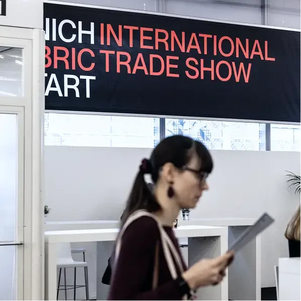
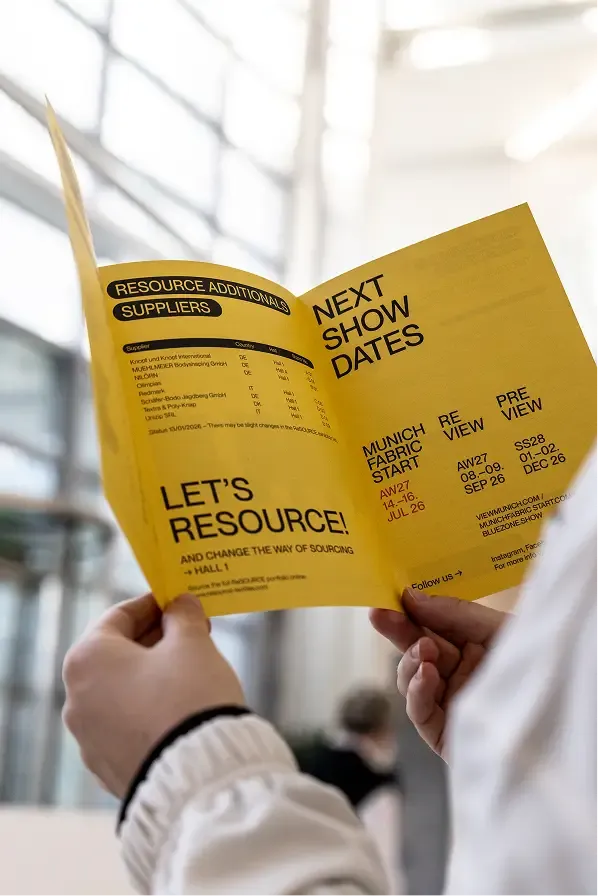
As you can see, one of the main challenges at the fair itself was to consolidate the ever-present need for information transfer on the one hand and to create a cohesive and coherent brand image on the other - aiming to generate more signal than noise. The design of the fair relies almost exclusively on the concept of information architecture, achieved through deliberate stylistic reduction on one side, and the conscious use of typography, lettering, proportions and a smart co-branding mechanic on the other.
Wayfinding System
The floor plan is the centrepiece of the wayfinding system that extends across the entire fair. It provides an overview of all halls and exhibitors – within the catalogue and on video walls – and guides visitors to their destination through signage and labelling. For all components relating to navigation and scheduling, we contrasted the simplicity of the brand with bubbles and pills – to provide a high degree of clarity and orientation.
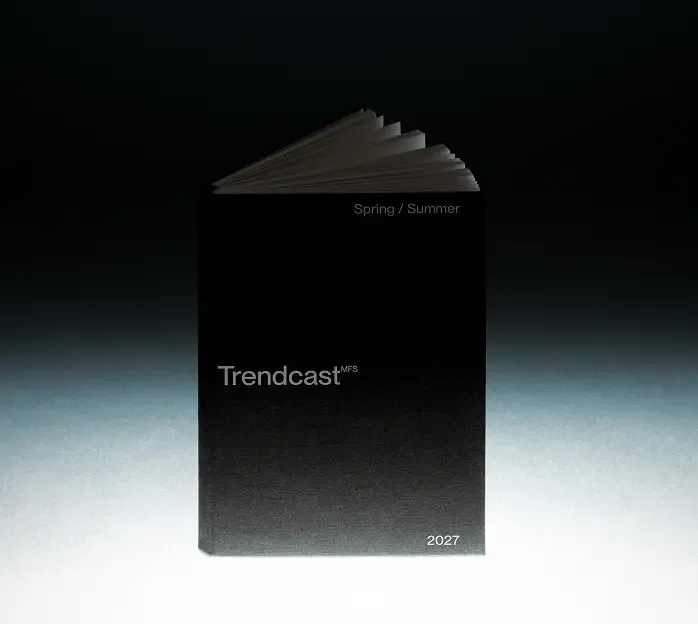
MFS Trendcast
is a definitive collection of the trends shaping the upcoming season, offering industry partners valuable insights from the very beginning of the value chain. We had the pleasure of giving form to this roughly 140-page manifesto – curated by Katharina Majorek and Volker Orthmann.
Seasonal Theme
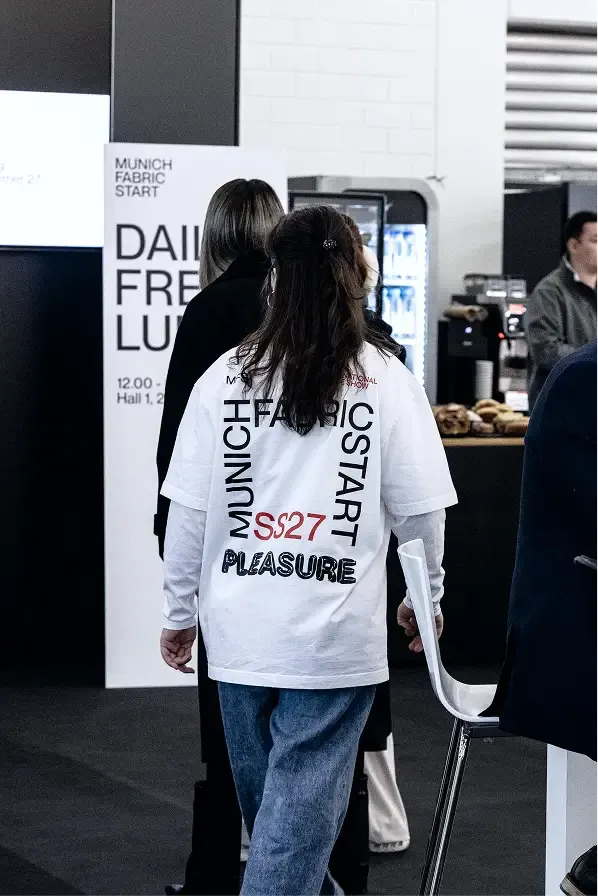
Building on the fair's corporate design, we develop a key visual twice a year that represents the motto of the respective season. For the Spring Summer 2026 edition, the theme was "Pleasure" – for which we reinterpreted the concept of "materiality". We show skin in super close-up. For us, it symbolises the canvas on which fabrics are felt from within and unfold their effect outward. Combined with a latex- and balloon-like typography, an unexpected contrast emerges – and an almost haptic experience.
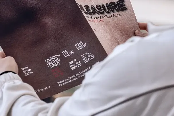
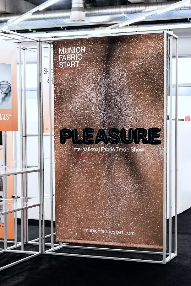
For the Autumn Winter 2027 edition of the fair, we visualised the motto "Taste". To do so, we took a deconstructivist approach – stylistically unweaving a fabric to create abstract new forms from the resulting threads, connecting them to the overarching theme. From these infinite possibilities of interlinking, something emerges that resonates with us. Much like taste itself.
More Projects
HCK®
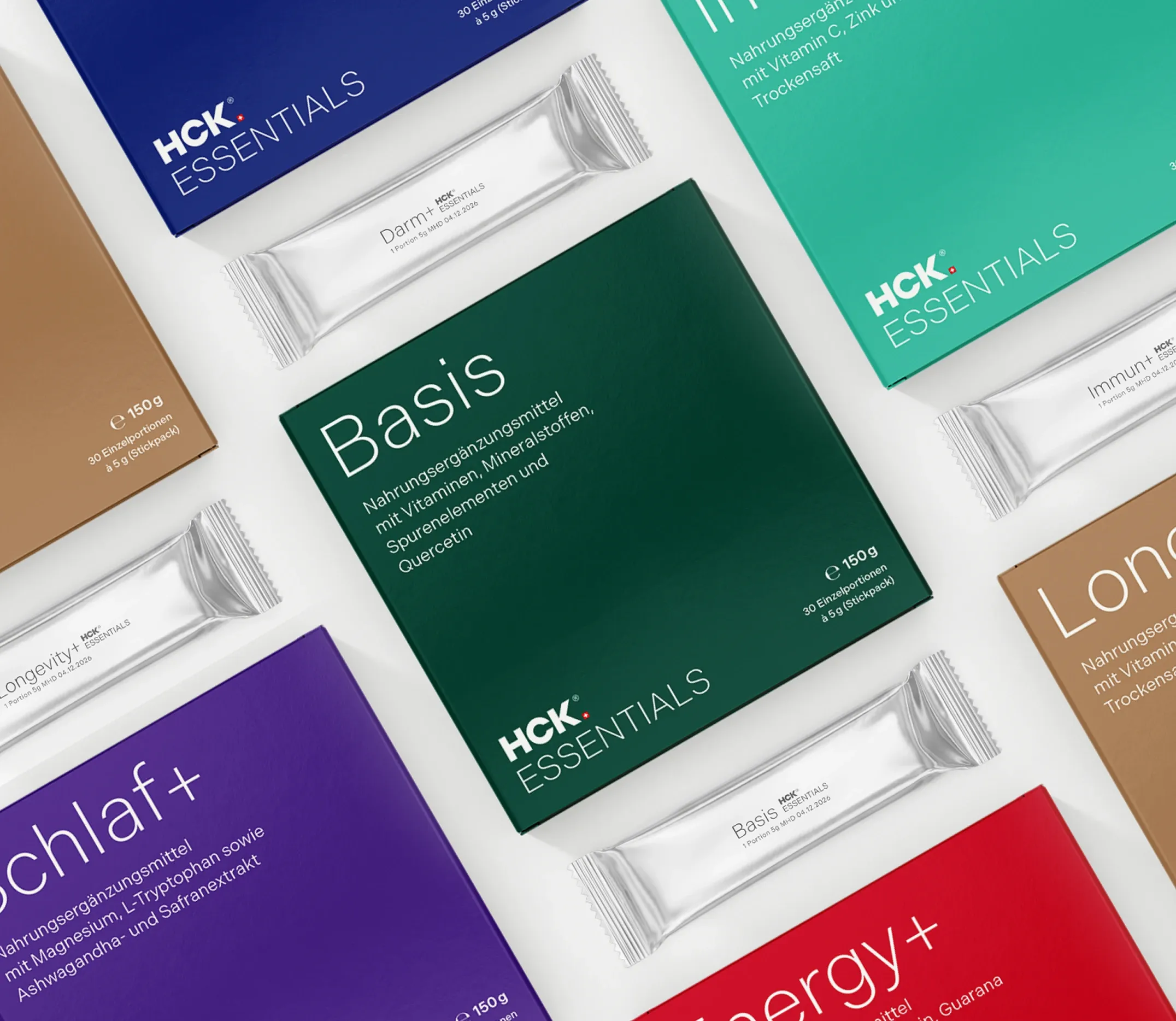
HCK® is a traditional Swiss company that offers micronutrients tailored to individual needs, based on concrete laboratory analyses and a patented galenic formulation. We helped them relaunch their brand from the ground up to make it D2C-ready. This included the brand fundament, the corporate identity, the packaging design and the communication strategy. More ›
GLS Bank
We helped Germany's most sustainable bank – and its best bank for gender equality, transparency and climate protection – communicate its products and services, and the world, just a little. More ›
Helene Fischer
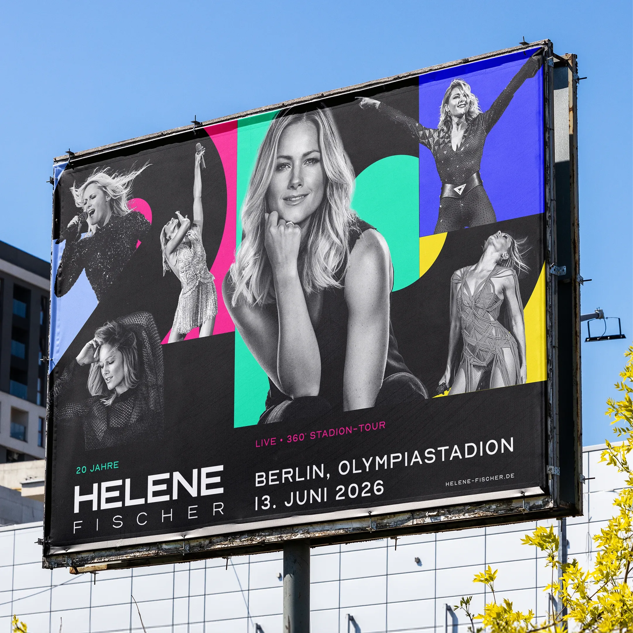
Helene Fischer is arguably Germany’s only true pop star. She captivates people across all generations, genders, and social backgrounds. We were responsible for the campaign promoting her 20th-anniversary tour, covering out-of-home advertising, TV, and social media, as well as—a real highlight for us—several collector’s edition postage stamps created in partnership with Deutsche Post. More ›